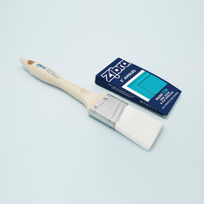
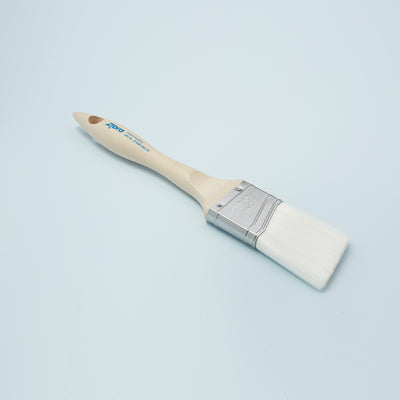
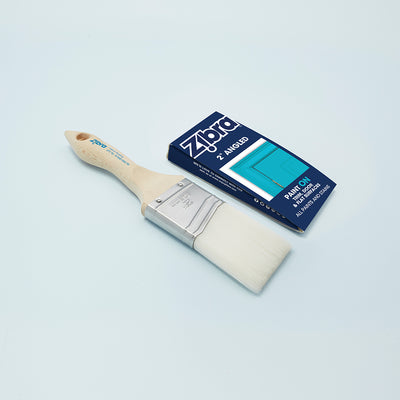
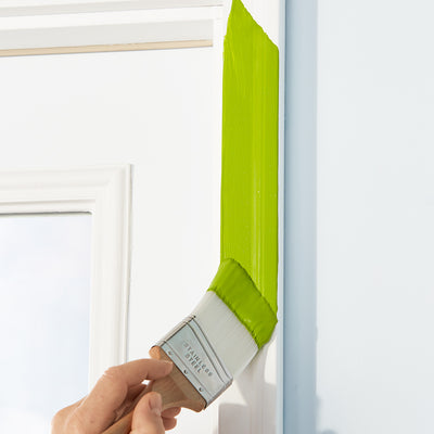
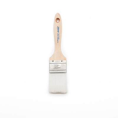
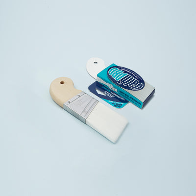
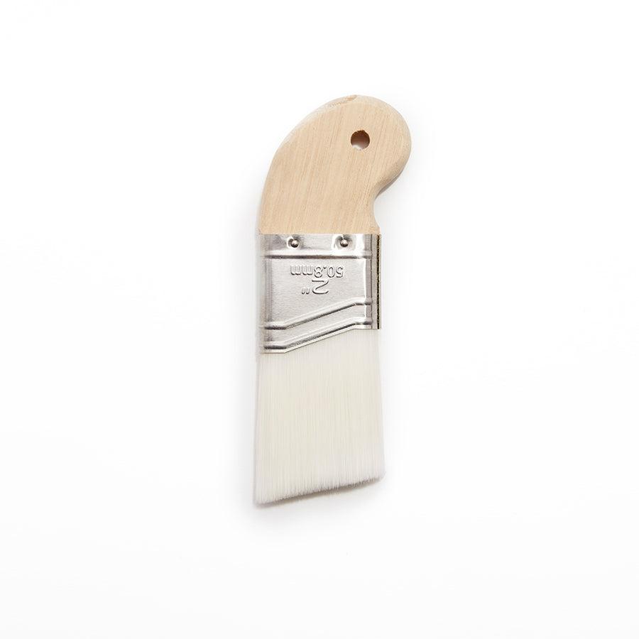
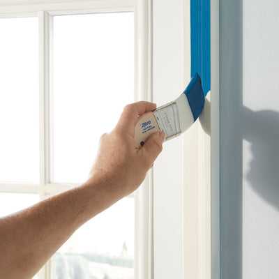
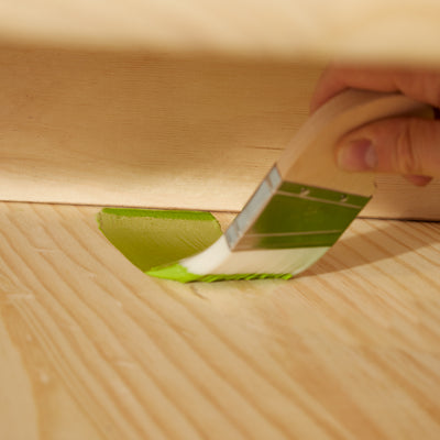
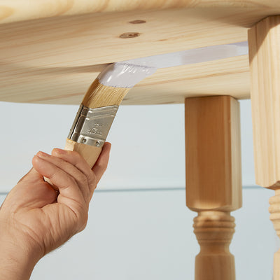
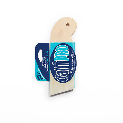
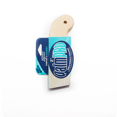
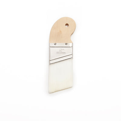
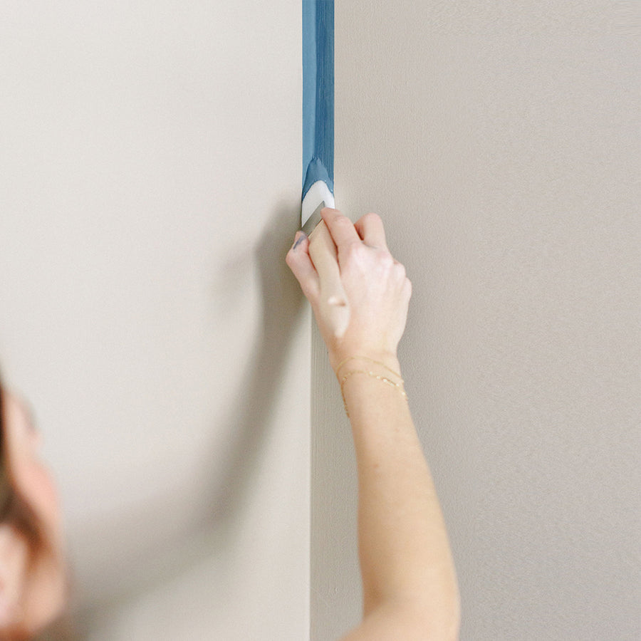
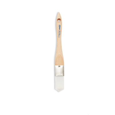
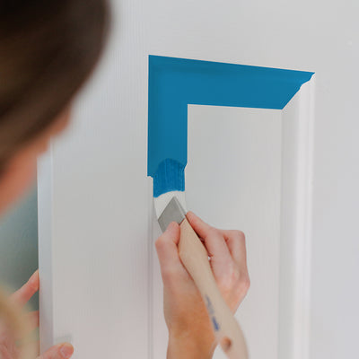
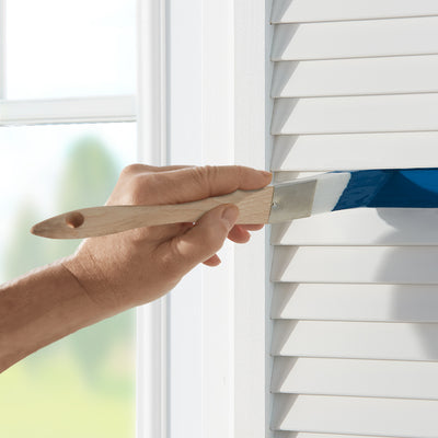
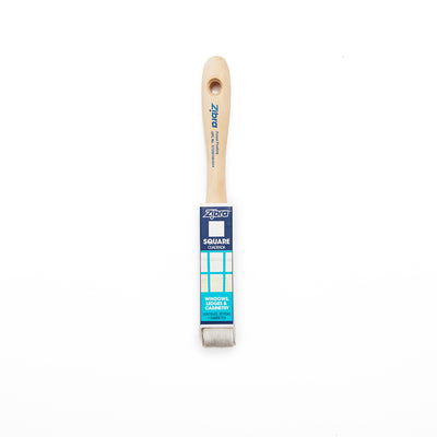
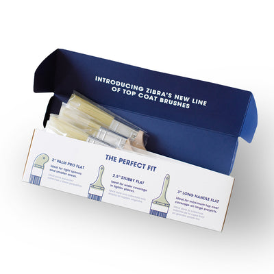
OPEN FOR PUBLIC VOTING

Let your voice be heard & help out your favs- give your favorite in EACH category a 👍 to officially cast your vote!

One vote per category, per person. Voting closes Feb 24th at 11:59pm EST.

Stroke of Genius

Celebrates the most original and unexpected projects. Honors bold ideas, creative thinking, and work that proves there's no limit to what a brush can do.

Chris Bingham

Chris Bingham

Ty Ball

My father purchased this old 1985 RV for the whole family of die hard Cincinnati Bengals fans to go and tailgate together. I'm an elementary Art teacher, so during summer break I parked the RV in my backyard and spent the days painting away. We surprised my dad once it was all done! WHO DEY!
Sydney Dunmore

Sydney Dunmore

This mural was designed and painted to look as though it were created with a cup of coffee. I figured that this would be the perfect addition to a small town coffee shop, named after the mountains and foothills in the area. We’re all familiar with the coffee-painting trend that uses coffee like watercolor, but recreating that effect on a mural was a completely different challenge. Pushing myself to solve that visual problem is why I chose this piece for the Stroke of Genius category.
Gabby Smith

Gabby Smith

"Dubble Bubble" was a public art project painted in the tiniest museum in Mississippi- the Hattiesburg Pocket Museum! I love painting nostalgic art and this piece really brightened up the area with whimsy and joy :)
Aditi Heins

Aditi Heins

We were asked by our client, Goodwill of Central Oklahoma, to paint a mural for their new Enid, Oklahoma store. The goal of the mural was to bring a sense of community pride, and invoke excitement in the community about the new Goodwill location. Enid is the Wheat capital of the U.S., and it was important to the client to showcase it in the mural design

Color Crush

Recognizes outstanding use of color—from harmonious palettes to daring combinations. If color is your superpower, this is where you shine.

Kayla Mahaffey

Kayla Mahaffey

Rebekah Rose Ressler

Rebekah Rose Ressler

I painted this 208sqft mural in five days for the Sun Prairie Mural Festival in Wisconsin. I’ve chosen the color crush category because I feel really proud of this color palette. Initially, when I requested paint for this project I requested 24 colors, but had to whittle it down to 15– which I did! I mixed the mid tones and lighter tones myself, and achieved enough contrast to keep the viewer engaged but not overwhelmed. The design itself is busy with detail, but because the color palette is harmonious it doesn’t feel overwhelming– it feels serene and peaceful. I strategically placed bright yellow to keep the viewer's eye moving around the mural. The larger sections of black help maintain the figures as a dominant focal point. It’s important to me that the figures are a focal point because my work centers queer and trans people. I use repeating colors to represent the interconnectedness of queerness to the natural world. As if to say, “We are here, and yes we are supposed to be here.”
Hannah Tews

Hannah Tews

Painted in the dark and lackluster entrance of the Racine Zoo’s Historic Castle Building, Vanishing Kingdom is a bold, colorful mural celebrating the animals who call that space home. Inspired by a childhood spent around animals—both parents were zookeepers—the mural features playful portraits of real-life residents, welcoming visitors and staff with warmth, curiosity, and energy.Bright colors and friendly expressions turn the entrance into a lively, inviting moment—one that sets the tone for exploration and connection as soon as you arrive. Designed to feel open and approachable for all ages, the mural meets visitors where they are and invites them to look a little closer.At its heart, Vanishing Kingdom is about noticing the animals around us today—and believing in a future where they continue to thrive alongside us.
Sophie Groenstein

Sophie Groenstein

"Tulsi" celebrates vitality, protection, and growth through bold, saturated color. The plant weaves through the figure as a symbol of grounding and resilience, while warm oranges, reds, and purples create a glowing, almost sunset-like energy across the entire piece.I chose Color Crush because color is doing the storytelling here. High-contrast hues, rich gradients, and vibrant greens give "Tulsi" its life force and make the mural feel energized and alive. The Zebra brushes I used helped keep the color expressive, fluid, and punchy at scale.
Jeanette Johnson

Jeanette Johnson

This mural was painted as part of a local arts project in Blair, NE. The selected theme was agriculture and I wanted to make sure that the composition and color was bold and graphic. I wanted there to be highly saturated color, clean lines, heavy contrast and timeless visual impact. The title of the work is "The Products of My Farm Are These" after the poem by Emily Dickinson, reflecting the heavily agricultural background of the area including cattle, corn, Missouri River traffic, the railroad, and the communities multiple pollinator gardens.

Transformation of the Year

Show us your most impressive before-and-after. Furniture flips, wall makeovers, DIY magic—if you transformed it, it belongs here.

Eugene O’Neill

Eugene O’Neill

This image honors Jun Yasuda the steward of the Grafton Peace Pagoda in Upstate NY. She is a living gem (IYKYK) to my community but she is world renowned for her lifelong efforts in advocating for peace, indigenous sovereignty, anti war, anti racism, environmental protection, and humanitarian rights. She is well known for her Peace Walks/Protests in which she is chanting and beating her signature drum. The chant (the vertical Japanese text) is “Namumyohorengekyo” which in nichiren Buddhism translates to “Devotion to the law of the lotus sutra”. A chant meant to channel intuition of self, connection to all living things, harmony, balance, and achieving happiness in this lifetime. The lotus breaks through “the ceiling” showing her lifelong devotion to the practice in the face of seemingly immovable adversity. This building houses a giant community of artists shops and businesses, but with its industrial facade you would never know. They run so many community centric events it was time for the entrance to come alive. This has generated much gratitude inspiring a spark for more art to come on the building.
Story Chang

Story Chang

We transformed a cable spool into a playhouse.
Dani Romay

Bebe the Bus began as an ordinary school bus and was reimagined as a moving canvas. Through a complete 360-degree, full-coverage mural, the entire vehicle was transformed into an immersive work of public art. Flowing forms, bold line work, and vibrant color wrap every surface, blurring the line between transportation and installation. The design invites viewers to experience the piece in motion, shifting with light, speed, and environment. I am submitting Bebe the Bus in this category because it exists beyond the boundaries of a traditional wall. This project transforms a once-utilitarian object into a living artwork and a traveling venue. Now operating throughout the Kansas City metro as a mobile space for parties and community gatherings, Bebe the Bus brings art directly to the public—creating surprise, connection, and celebration wherever it goes.
Jeff Davis

I ultimately chose the transformation category but the craftsmanship and detail category was also considered. The following is how I converted this old secretary into a decorative wine cabinet. I removed the finial and scroll molding and replace it with crown mold. The back was removed and replaced with a mirror and glass shelves were added. LED lighting was added to the upper cabinet. The door mullions were replaced with leaded glass panels which I designed. The cubbies and mail slots were removed and a stemware rack added. The bottom two drawers were converted into a wine rack. The whole piece was meticulously painted in a malachite finish with black and gold trim with red details.
Odessa Helm

Odessa Helm

Painted in the summer of 2025, this nearly 3,000-square-foot mural was created as part of a full renovation of this park space. The artwork honors Angelina the Caddo Indian, an important historical figure and the only woman in Texas that a county is named after. The river and forest behind her are also named in her honor, and the mural features native Texas wildflowers throughout the design. I submitted this mural for the Before & After category because the transformation of this space is dramatic, and getting to celebrate Angelina’s legacy through this project was such a meaningful and exciting opportunity.Because this wall is stucco, painting into the grooves was especially challenging.

Detail Devotion

For artists with exceptional technical skill and precision. Highlights crisp lines, blended textures, and craftsmanship that turns details into showstoppers.

Julie Xiao

Julie Xiao

I am entering this painting Wood Snake, in the Detail Devotion category because the work emphasizes technical precision and meticulous craftsmanship. The piece is an acrylic painting on canvas that showcases my signature precise line work, with each scale individually painted. Careful attention to line quality, texture, and detail makes this a visually striking piece.
Sabah Contractor

Sabah Contractor

This piece reflects my commitment to patience, precision, and the quiet discipline of detailed, hand painted artwork. I chose peacocks not only for their visual complexity and beauty, but for their cultural significance in India, where they symbolize beauty, devotion, prosperity, and enduring love. This artwork was created for a couple’s wedding anniversary, making the subject especially meaningful as a representation of partnership and harmony. Each feather, blossom, and branch was painted slowly and intentionally, with careful line work and layered blending to build depth and movement. The feathers were painted one by one, requiring repetition, control, and consistency. Painting across multiple drawer panels challenged me to maintain alignment and cohesion so the imagery would read as a whole story of two birds enjoying one another amidst a scenic setting. I have used a strong contrast of orange for the base and blue for the artwork, which are beautiful colours that complement and contrast each other for a striking end result. I am entering this piece in the Detail Devotion category because its strength lies in hand painted craftsmanship and carefully executed artwork using the tiniest of brushes at times. The impact comes from precision, hours of focused brush work, and the accumulation of fine details that invite close viewing and reward attention. I have paid special attention to the face and eyes of the peacocks, because the expression is very important. The feathers have been painted in a way that gives a sense of movement. The detailed blossoms and branches add to the drama and natural setting.
Paige Dirksen

Paige Dirksen

This mural spans a 2,800-square-foot wall in Dothan, Alabama. The design draws inspiration from the region’s native flora, including a flower cultivated into a new variety by a local resident—an intentional nod to the community’s living relationship with the landscape.The scale of the wall, combined with architectural interruptions such as doors, electrical boxes, and aged brick, presented significant design challenges. Rather than treating these elements as obstacles, I integrated them into the composition, allowing the movement of the flowers to guide the viewer’s eye fluidly across the wall, although the sheer size made it really hard to photograph.I selected the Detail Devotion category because careful attention to texture, layering, and dimensionality was central to the work. I tried to add just enough detail into each element so that it would visually lift from the wall, creating a sense of immersion—inviting viewers into a vibrant, enveloping environment. Ultimately, the color palette and composition were chosen to transform a once-worn space into one that radiates warmth, vitality, and joy.
Katelin Colburn

Katelin Colburn

The City of Hapeville has long been considered the ‘city of the arts’ and has always used butterflies as a representative and repeated theme throughout the cities history. Everything from painted butterfly sculptures throughout the city, butterflies on promotional materials and even butterfly themed festivals. This painted Photo Booth is an interactive public art installation that encouraged community engagement and interaction at one of the largest events of the year, The Butterfly Lantern Festival. The design was created to be a ‘paint by numbers’, allowing people of all ages and abilities to come contribute to this project that now sits in the middle of the city. After the City event I used my Zibra brushes to complete and re-outine this design, making the detail pop and more crisp. This project sits as a functioning Photo Booth for the city to use and admire, knowing that they too had a hand (or a paint stroke) in making this public art project come to life.
Emily White

Emily White

This mural was created for a specific neighborhood in Philadelphia called Northern Liberties and is titled "Can I paint that dog?". The wall was directly across the street from a dog park I used to bring my dog to frequently and this specific neighborhood has dozens of dog-related businesses, so I really wanted to include dogs from the neighborhood in the mural. I put out a call for photo submissions, so all the doggos (and one hairless Guinea pig!) featured in the mural are residents of NoLibs. I also included native flowers of PA, along with some flowers they had in bloom at a public garden/park on the same block. It was painted in my studio on parachute cloth, and then verrry carefully cut out and gelled up onto the wall. The "Detail Devotion" category seemed like a good fit for this piece. My work often combines detailed realism with crisp stripes, and craftsmanship is always very important to me.

Vision to Reality

For artists with exceptional technical skill and precision. Highlights crisp lines, blended textures, and craftsmanship that turns details into showstoppers.

Keely Perkins

Keely Perkins

This is a Veterans Memorial Mural in Miles City, Mt. I knew I didn’t want to do the American flag and eagle that you see in many Veterans murals. It started with poppies and evolved from there. The local VFW gave me a list of symbols they wanted to see in the mural. I was able in corporate all of them in the mural. All branches of the military are represented. This project took a lot of planning because everything needed to represent someone or thing. It is a thank you to all veterans and it is our communities way of showing all veterans we see them and acknowledge all they have done for our country.
Riley Johnson

The Urbana Mural is a historic, community-driven landmark in Urbana, Ohio, completed over five weeks after nearly eight months of planning and outreach by 22-year-old artist and student Riley Johnson. What began as a personal vision to give back to his hometown grew into Urbana’s largest mural to date.Johnson secured the wall through door-to-door outreach, coordinated necessary wall repairs, and invited the community to contribute stories, photos, and memories that directly shaped the mural’s layered collage design. The work celebrates Urbana’s past, present, and future through historic imagery and symbolic storytelling.The project transformed a blank wall into a lasting cultural landmark for a city of approximately 11,000 residents, reflecting the power of vision, persistence, and community collaboration.
Justine Turner

Justine Turner

I created this mural for an apartment complex in Golden Hill, San Diego, CA in June of 2025. The concept was a love letter to the neighborhood, a very special pocket of town where small canyons and hiking trails wind through the backyards of historic homes and small, multi-family complexes. Even though we're a few minutes from downtown, we share our outdoor spaces with coyotes, hawks, Squirrels race through loquat trees heavy with fruit and the streets are lined with giant magnolias, passionflower vines and night-blooming dragonfruit. I chose a metallic gold accent for the moon and bottom portion of the wall in honor of "Golden Hill" and layered a .JPG of gold foil texture into my mockup for the client to help them visualize the finished wall. I also enjoy illustrating the mural site during the planning process and submitting it along with a mockup on a photo of the location. I freehand my murals and love the freedom that gives me to adjust size and position of certain elements but was really pleased with how similar the finished wall turned out compared to my sketch.I chose to enter Vision to Reality because I really love the research and planning portion of a mural-- I take a lot of pride in the proposals that I submit to clients because it sets expectations, shows dedication and helps me immerse myself in the world that I'm painting before I put the brush to the wall. This was my first mural and the client was so pleased with it that we added another two walls to this project in different areas of the apartment. It received wonderful feedback on Instagram and NextDoor, where local residents immediately recognized it as being neighborhood-themed and expressed appreciation for brightening up the street and honoring our unique and special surroundings.
Martin Ortells

Martin Ortells

We Got The Beats new record store in Dania Beach, asked for an Elton John from his 70's era themed inspired mural. I took that spark to create a vibrant and colorful Goodbye Yellow Brick Road style artwork.I had to work around the wall dimensions to design a piece that incorporated elements of the famous album cover with new ones like the vinyl Sun on the horizon. An empty gray box type store is now full of color and music to enjoy!
Julia Kenyon

Julia Kenyon

This mural was designed and painted for Magic Noodle House in Denver as a fully custom, site-specific piece that brings the brand’s story to life. Inspired by traditional Asian iconography and the magical ritual of making hand pulled noodles, the concept was developed from initial moodboards and sketches through a detailed digital mockup and final execution on the wall. While the design was carefully planned from the start, like any mural project, adjustments had to be made on site in response to real-world conditions such as lighting and how customers would interact with the piece. For example, the background wall looked different in person and shifted in tone as light hit it differently, requiring me to make subtle color palette refinements while staying true to the original vision. I’m entering this project in the Vision to Reality category because it represents my complete creative journey. From thoughtful planning and collaborative ideation with my client to adapting in real time during execution. The project demonstrates my ability to translate a clear concept into a finished, immersive environment while responding to the realities of scale, lighting, and space. The final piece reflects both strong creative vision and the ingenuity required to bring that vision to life.